• Digital UX Work
  • Print Work
  • About
  • contact me
Menu

Liz Robinson Design

Liz Robinson - Welcome To What I Love. Design and UX.
  • Digital UX Work
  • Print Work
  • About
  • contact me

Liz Robinson's Digital Work

U.S. Bank

Introduction

This was a take over completely of the U.S. Banks digital experience in brand. I was commissioned to roll out the interface while working closely with strategists on the Digital UX team.  

Situation

The whole website needed to be rolled out to express the new design. This involved strategic thinking from a marketing point of view and also a compelling user experience layout to bring the overall design to life. It needed to function on all areas of the U.S Bank brand and have a seamless experience to the viewer. 

Solution

I worked on imagery, layout and design to bring the overall message to life. I worked on multiple pages with in the site to incorporate branding and function to the interface. This was done across multiple platforms and made to include responsive design on every front. 

I worked with multiple teams and specialists to incorporate the practices in to the end result of the work. 

I would also be immersed into digital optimization and testing the product and interface to learn and move forward with an overall successful design in the end. 

Services

• Art Direction

• Design

• Wire-framing 

• Photoshop mockup


USBank.jpg
USBank-screens2.jpg

US Bank CDs

Introduction

This was a project commissioned to help users understand and choose their selected certificate of deposit.

Situation

Based on analysis and research from multiple sources, including working with our strategy teams, marketing, optimization and testing departments, I was tasked with the challenge to make this seamless and digestible to our online cliental. We had found during our studies that the average user has difficulty scanning and understanding exactly what they need.

I needed to come up a solution to make the pages across all platforms have ease of readability and scalability all while making a good amount of information flow in a streamlined design. 

Solution

A solution came about after a lot of research with the teams in collaboration. Also, a part of the process was looking into what other competitors are doing and how they are doing it successfully.

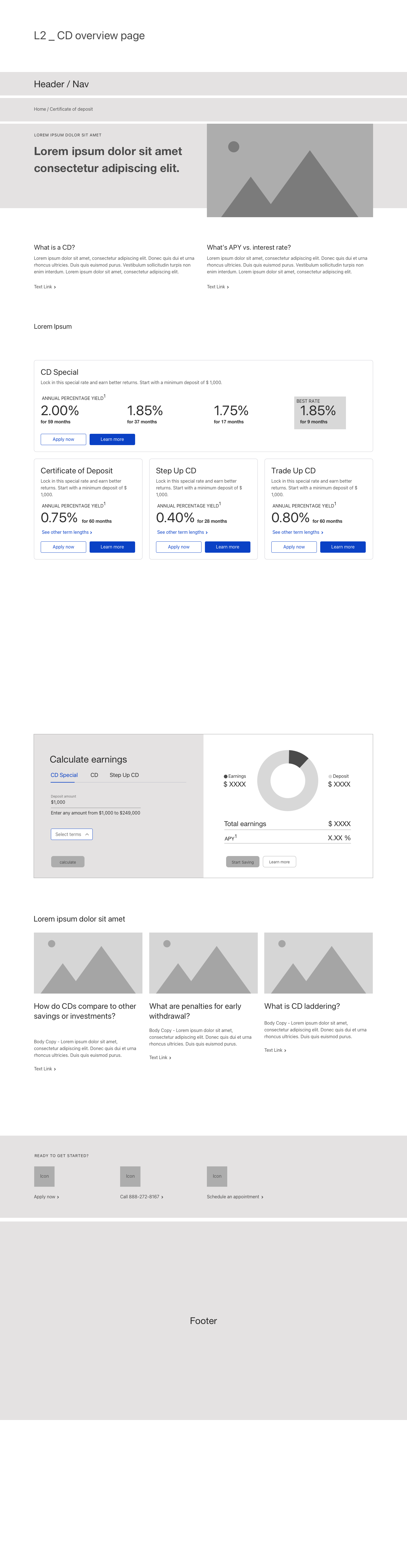
The hierarchy was flushed out in wireframes then into a fully flushed out design.

Starting with the top information. The user can understand not only what a CD is and how it works, but what an APY is and how it pertains to the CD itself.

Then the tiles come into place with a separation of the four different types of CDs in separated squares, so they can compare them based on major key points for ease of scanning and digestibility. They have CTAs based on two different directions “Start Saving” or “Learn More”. This helps the user branch into the different needs they may have.

Third after they have the main information of what CD they may be looking for, there is a robust calculator. After lots of research in keeping the information to the most important aspect the user has, I created a calculator in the US bank branded form to make sure it’s done with simplicity and ease.

Lastly, a bottom bar is created related to the CDs for other research such as articles and videos with U.S Bank’s products and needs, in keeping the viewer still engaged on the U.S. Bank site.

Services

• Design

• Wire-framing 

• Sketch mockups and libraries

• Adobe Illustrator and Photoshop

https://www.usbank.com/bank-accounts/savings-accounts/certificate-of-deposit.html

L2.jpg
L2 mobile.jpg
CD Special
CD Special
CD Special Mobile
CD Special Mobile
CD overview.jpg
CD product 1.jpg

CITI Card and Ameriprise Travel Insurance Website

Introduction

This is a microsite for a travel merge with Citi Bank and Ameriprise. This is an interaction page to involve the viewer to get a free quote .

Situation

The challenge was to put together two different brands and combine them into one seamlessly. By finding the comparisons between the two different brands, I created an auto insurance site that was compelling and easy to navigate. By understanding what the viewer’s needs are and directing them to the correct path digitally, the info structure of the site was a success. 


Solution

By utilizing big bold imagery and keeping the content concise and compact, the viewer can easily navigate to what their needs are. In this case, it was to get a quote by making the process simple and easy, the viewer is more compelled to finish the quote process in a timely manner. 


I also did the UX and Design for mobile as well. By talking a lot of information and placing it into a small space, I think of the mobile first discipline always. 


By making sure the infostructure and design are an overall success, this improves the viewer’s experience greatly.


Services

• Concept Development

• Wireframing

• Art Direction

• Photoshop mockup


citibank.jpg
citi-mobile.jpg

Sleep Number® x12 Microsite

Introduction

I created, branding, conceptualized, and directed the entire award winning web site from beginning to end. 

This was for Sleep Number’s innovation product. It’s a high-end product and we needed to go upscale. I went with an elegant, polished and high tec look, but it still looking like a bed. Even president Barack Obama even owns one. It’s an amazing bed!

This product can do it all. It’s voice activated, it heats up or cools you off on command, lifts when you need to read and turns on light on off on the night stands. It also lights up for you automatically to find your way, and of course adjusts to your perfect sleep number. 

Situation

Each year Sleep Number comes out with a revolutionary innovative design. That year was the x12 bed. We needed to create a microsite and overall campaign. This needed to be compelling and eye catching to propel not only the product it's self, but the over all Sleep Number brand forward in the technology world. I was nominated for this amazing task. 

Solution

The site works in a parallax navigation and moves left to right during each chapter. The site animates as if it’s a shutter revealing up and closing elements of the bed when landing on the next page. Each page has its own interactive experience, whether it be video, information or simply clicking on the buttons to reveal more information. 

This site is also responsive. So I was designing for different platforms and media such as tablet and mobile. This was closely observed and structured as well as desktop for an overall viewer experience.

The direct role I played in this was to work with the sales team and market this visually with a large budget. I conceptualized the site from a IA point of view, drawing wire frames and story boards while understanding the needs of what the site needed to entail to tell its story. I then visually designed the whole structure while keeping the budget, production and process in scope. 

During the UX process, I gathered crucial information to place in a hierarchy to make this website successful. I also worked very closely with the development team and a group of 3D animators to create video and have the site come to life interactively with all the bells and whistles.

Services

• Concept Development

• Art Direction/Design

• Photoshop mockup

* Wireframes

• UI/UX


iMac1.jpg
x12 parallax site_main.11.13.jpg
x12-2.jpg

SleepNumber.com

Introduction

Home page for Sleepnumber.com. "Biggest Sale of the Year" marketing share event and website re-design. 

Situation

The company needed to update the new website while still showing all of the different offers in one place. The challange was to make a lot of information visible, but still keeping the design clear and impactful. 

The other challenge was to show a lock up with a lot of information displayed, but in very strong and interesting way to project the Biggest Sale of the Year campaign. As it was the largest market share event the company has and it's very competitive climate in retail. It needed to jump out on screen and paper, while also having it look organized and clean.  

Solution

The website was placed in a hierarchy. The Biggest Sale of the Year being at the top and taking up most of the space, then adding the four smaller offers and products in thumbnails along the bottom as if it's in navigation. The best part about this is that the offers are in red and the product imagery doesn't show until rolled over when the viewers interest is sparked. Keeping the design simple and easy to read, viewers can navigate with ease. This was also done responsively. 

As far as the Biggest Sale of the Year layout, I created the look and feel of the sale incorporating the information in a tight, concise and easy to read format. A lock up that can be used across all mediums and print materials for the overall campaign. 

Services

• Art Direction

• Photoshop mockups 

• Illustrator typography

• Wireframe 

sleepnumberHP.jpg

Sleep Number® Sleep IQ Microsite

Introduction

All you have to do is sleep. An interactive device that tracks and monitors your sleep. A website design and interactive parallax microsite involving animation and video.

Situation

There is always a new innovation that comes out with Sleep Number and this was the undertaking for the Sleep IQ microchip that is placed directly into you mattress to track and optimize your sleep. This was the birth of this product and the company needed a website and over all campaign to support the new reveal. 

Solution

With this exciting new product, I was the main designer on bringing this to the forefront with a new informational microsite to push the new product in a competitive market. 

The work I did was mass amounts of research, wire-framing and working closely with the marketing department and sales to effectively showcase this product. It needed to be clear, concise, and compelling. 

By using a parallax navigation and telling a story in an interactive environment, the website succesfully flowed and delivered the correct information in a story that helps the viewer understand a quite complex product. 

By taking the viewer on a journey to better understanding the procduct and gaining excitement, they can learn and purchase the mattress with Sleep IQ technology from start to finish in a simple manner.

I worked very closely with the developers to make the site interactive, including fun elements such as video and animation to bring it to life. 

Services

• Art Direction

• Photoshop Mockup

• Illustrator for logo design/charts and inforgraphics

• UX

sleepIQrHP.jpg
Sleep-IQ-site_overview.jpg

CaringBridge UX Prototype

Home - AUTHOR_S1 – 1.png
CB.jpg
Journal Page View - AUTHOR_S1.png
Gallery Page View - AUTHOR_S1 – 5.png
Ways to Help - AUTHOR_S1 – 3.png
Tributes - AUTHOR_S1.png

Ameriprise Website

Introduction

This was an complete re-brand of the Ameriprise digital experience. 

Situation

The company needed to be current and fresh with their presence online and to their customers worldwide. I was commissioned to undertake the entire rebrand experience and push it to the other elements of the home site as well as the Auto and Home division. 

Solution

By maintaining the production, imagery, and overall user experience on the web presence, I brought the brand to life by utilizing a well encompassed use of these elements to better the user interface as a whole. 

Services 

• Art Direction

• Design

• Photoshop mockup

• Flash Development

ameriprise.jpg

Premier Pontoons Website

Introduction

A website for Premier Pontoons

Situation

Our team had set out to create a brand new website for the company. This was to be refreshed and to showcase the new product in a more appealing and updated way. 

Solution

I was placed on the role to design an interface that shows the lifestyle beauty shots in a more impressive manner. After a great photoshoot by the team, I added these in a bold intriguing way by highlighting the product in large photo format. This also, compels the user to imaging themselves on the Pontoon and enjoying life with the product. 

I also helped with making an interface in an interactive space by having the viewer literally build their Pontoon just the way they want it by choosing color, style, and elements for the product such as shower, toilet, slide, ect. Then when created, directly contacting a dealer when they know what they'd like just by interacting with the website it's self. 

Services

• Photoshop mockup/Art Direction

• Flash

• HTML for end coding on platform

• Production

premier.jpg

Long Live Your Dog

Introduction

This is a website for Purina virtual Dog Park and informational site. ( Facebook for dogs) 

Situation

We needed to design something that would be compelling to an audience who loves dogs. The basis was to have information about the product while keeping it interactive and fun. 

Solution

The site was created to involve a interactive landscape and environment for users to engage in and keep coming back for more. 

This was done by creating a social media environment for dogs! What a fun way to keep visitors interested. Have you ever wanted to make a Facebook page for your dog? That's exactly what was done. You can upload pictures, video, and stories about your dog and share it with other dog owners. 

I created the interface and animation widgets to exist in this park environment. 

Services

• Photoshop mocks

• Animation

• Production

• Team Collaboration 

park_lg.jpg
park.jpg

Gettington E Commerce Website

Introduction

A website from BlueStem Brands for products in a retail environment. This is a higher-end more stylish brand than Fingerhut their sister brand. This company appeals to an audience such as Target or JCPenney. 

Situation

I was commissioned to work design and production of the overall site by keeping with the branded style and showcasing the products in a clean precise manner. 

Solution

When making the offers attributing to a certain product showcased, the typography and over all  look and style needed to be consistent to the Gettington brand. This was achieved by taking a  lot of information and laying this out in a hierarchy, keeping it clean and easy to navigate.

This helps by attributing to the overall elegant style branding Gettington is about.   

By professionally making sure each of the elements of the website stayed consistent, had the correct resolution, tone color ect., the website will function seamlessly through out the site.   

Services

• Photoshop mockups in design

• Sketches for pitch

• Production on website


gettington.jpg

Chex.com

Introduction

An informational home page for Chex.com.

Situation

To have a landing page for Chex that's interesting and helps the viewer find what they need and are looking for easily. All doing so while feeling the warmth of the Chex brand. 

Solution

I created a landing page that included the latest campaign of the season, helping to find great Chex recipes, and learning about the product in a sales approach to get the viewer excited about Chex. I created the interface to include all of this while still keeping it interesting, easy to navigate and fun. The little Chex pieces rotate for visual appeal when rolled over as well.

Services

• Photoshop mock up 

• Animation

• Team Collaboration

chex.jpg

Fingerhut Website

Introduction

A home page design and product visual production for Fingerhut.com

Situation

The Company Blue Stem Brands were in need of website design elements for all of their products. 

Solution

I was commissioned to come up with the adverts on the layout to go along with Fingerhut's style but still promote the products themselves. The challenge was to cross brand, whilst bringing the over individual products showcased, to flow in navigation and across the site design as a whole. 

This was done carefully to not have the site look too overwhelming. This was because due to all of the different elements and styles of the individual brands shown, it was achieved in a well though out and easy to read template and interface. 

Services

• Ad and website design

• Photoshop layout

• Website production

fingethut.jpg

3MTM ESPETM Email Design

Introduction

3M Email design and code

Situation

3M ESPE needed a email campaign designed to roll out their new product. It needed to go along with the print collateral previously designed. This needed to live in an email enviormnment and function as a digital piece as a counter part to the print brochure collateral. 

Solution

designed the email based off of what the direction of the style was and tone. I worked in an email environment to make sure the product and the message was clear and made for an email interface. This was achieved by adding interest with visual to describe the Retraction Capsule, by using a humming bird, this helped bring across the function of how precise the product was. Also by narrowing down the information into bullet points, this helps the viewer read the email easily, quickly, and effectively.

Sevices

• Art Direction

• Photoshop mockup

• Dreamweaver and email code via Mail Chimp utilizing basic html


filtex_main.jpg

Alumacraft Website

Introduction

This is the Alumacraft website for design and production.

Situation

Alumacraft needed a refresh for an entire website. This needed to be updated and showcase the new products available. 

Solution

I was on a team of people to help roll put the over all production of the website. This needed to be done quickly while utilizing a strong attention to detail. Also paying attention to design and making it better function when needed. 

Services

• Design

• Production

• Photoshop

• Frontend website development platforms 

alumacraft.jpg

BR Group Environmental Engineering

Introduction

A full brand identity in a package. This includes the logo, business cards, letterhead, cover letter and website. This is for an Environmental Engineering company.

Situation

The client wanted a whole identity to start off the company. I was up for the change. 

Solution

I Art Directed the project form beginning to end. This was done collaboratively as well. The company's identity needed to be fresh, timeless, technical and unique. I didn't want this to look like other typical construction or engineering companies. So I set out to create a fresh blue instead of the typical orange that is seen with the tired competition. I used technical lines, but still utilized fresh outdoor shots to marry the two. I took the photographs myself and placed them in to a simple yet very effective introductory/informational website.

Services

• Art Direction

• Photoshop mock up

• Illustrator design

• Indesign

• Photography

• Dreamweaver/ html


br_lg.jpg
prev / next
Back to Digital UX Work
USBank_thumb.png
2
U.S. Bank
6
US Bank CDs
citi_large.jpg
2
CITI Card and Ameriprise Travel Insurance Website
x12+parallax+site_main.11.13.jpg
3
Sleep Number® x12 Microsite
snHp_large.jpg
1
SleepNumber.com
sleepIQ_main.jpg
2
Sleep Number® Sleep IQ Microsite
6
CaringBridge UX Prototype
amer_large.jpg
1
Ameriprise Website
prem_lg.jpg
1
Premier Pontoons Website
park_lg.jpg
2
Long Live Your Dog
gettin_lg.jpg
1
Gettington E Commerce Website
chex.jpg
1
Chex.com
largeIMs.jpg
1
Fingerhut Website
filteck_large.jpg
1
3MTM ESPETM Email Design
Screen+shot+2011-02-09+at+2.28.07+PM.png
1
Alumacraft Website
br_lg.jpg
1
BR Group Environmental Engineering